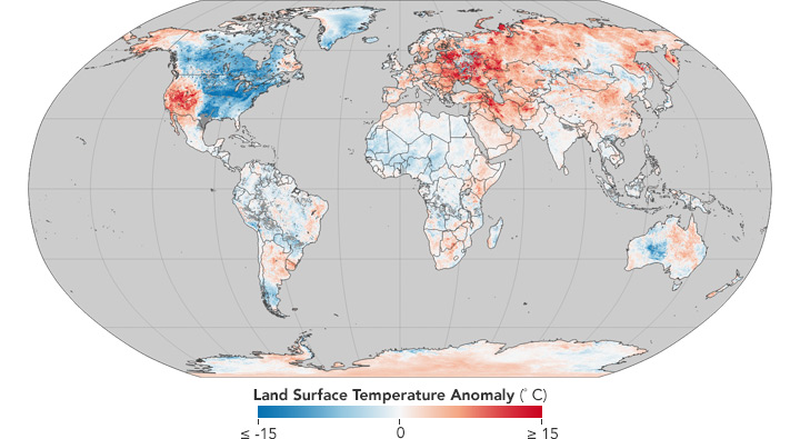
Source: NASA
Source: Cornell University

.jpg)
Data about the Earth are increasingly strategic to understand the current condition of our planet and its evolution. A network is emerging associating an increasingly large number of actors from different regions and sectors, either informally through scientific cooperation or under the auspices of the United nations. It concentrates data harvested by the members, attempts to model the global ecosystem and makes predictions, to help design policies to adapt to and mitigate the impact of climate change.
The present work aims to investigate this network as the interactions of the components of a complex system for global earth monitoring. It interacts with social, economic and political structures, generating frictions and feedback loops. We propose some insights of the underlying mechanisms of Earth data flows, exhibiting both resilience or impediments to the flows of information and knowledge which result from tensions between different interests. Data visualization are proposed to better understand the power relations at play.
A project by Titouan Poisson, Pascal Carrivain, Clément Renaud & Stéphane Grumbach at IXXI in Lyon, 2018.
Information about activity of our planet comes in all forms and shapes. It is produced and used by thousands of actors for multiple purposes. The methods, tools, motivations and methods behind the production of climate data are driven by common or diverging interests (strategic, commercial, scientific, etc).
Take inventory of the different forms taken by data on Earth will be an impossible task. Data avaibility is sporadic and many interesting information does not exist under a well-structured format. In this research, we select a few examples and approaches to provide a first set of insights that will help us refine a larger and more systematic approach for this ongoing investigation.

We use existing databases to extract information and consider the avaibility of information.

We manually collect, aggregate and structure information about existing organizations and stakeholders of climate data.

We use different technics of mapping and visualization to produce representations of the observed phenomenons (exchanges, flows, circulations, etc)
The Earth monitoring system was continuously built throughout the 20th century, from its technologic components to the political framework. The several following timelines trace this history by highlighting the major milestones in the emergence of the various actors at stake.
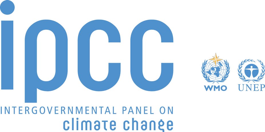
The Intergovernmental Panel on Climate Change (IPCC) is the world leading institution regarding climate change challenges. It deals with the tremendous task to synthesize all human knowledge about the phenomenon and its implications for human society. A large number of authors and reviewers coming from all around the world write an Assessment Report every 7 years. This visualization displays authors'and reviewers' nationalities for each assessment report and shows how IPCC is evolving from a United States driven institution to a world driven institution.
See the vizPermafrost is defined as the ground which stays frozen for two years or more. Mostly located in high latitudes, the permafrost has been diminishing for many years due to global warming. Two Essential Climate Variables defined by the Global Climate Observing System (GCOS) are related to permafrost. This visualization depicts the Global Terrestrial Network for Permafrost, which is the worlwide initiative for permafrost essential climate variables monitoring.
See the viz
We use data from PubMed, a database with advanced search engine to request medicine and health publications, to explore the scientific publications.
A glimpse at scientific collaboration worldwide based on IPCC main keywords.
See the GlobeA correlation graph of the hottest topics based on IPCC main keywords.
See the hottest topicsThe two vizualisations (a third one is in progress) we propose here have to be consider as exploratory tools of climatic data we gathered. Before clicking the button of the vizualisation you would like to see, please consider reading the two small introduction paragraphs right below. We are actually working on a third vizualisation, a graph about the architecture of the hot topics. To go further, more details can be found here See the details. The complete data for 2018 will be released early january 2019.
We propose first a coarse-grained view of the academic exchanges on IPCC main keywords. Indeed, we look at the number of publications N per year with the requested keyword in the title. From there we can construct a publication velocity V between year Y-1 and year Y. Obviously, the total number of publications is growing fast and therefore we normalized our results by the total number of publications. We build then a phase portrait (a concept from the field of physics) as a tool to explore the dynamics of publications. The phase portrait does show the time as an implicit variable. Therefore, our tool draws a timeline evolution of the normalized number of publications topic too. We clearly see an explosion of academic works about climate, greenhouse gases ... Eventually, we tackle the academic focus on the "Food and Agriculture Organization" (FAO) data. Indeed, the FAO provides great details on agriculture and associated CO2 emissions. Surprinsigly enough, the timeline evolution of the FAO academic concern is quite "chaotic". Nevertheless, a more detail vizualisation of the FAO data at the scale of country is far from without interest. Now that we request enough data to do some statistics we are working on potential publication dynamics between main keywords. We are currently building kind of a matrix of X-keywords correlations that will give us access to the differents levels of the IPCC main keywords architecture. Our first result is that the architecture of the IPCC main keywords in the framework of pubmed is limited to the two keywords correlations. Beyond, no academic exchanges have been extracted from the pubmed database.
We request the database to count the number of publications with two IPCC hottest topics in the title and in the abstract. The hottest topics are the topics with a number of publications per year greater than the average of the publications over the IPCC topics. The vizualisation we propose here is a a tool to explore the link between the hottest topics. You can display all the links an hottest topic make or just display the links between two of the main topics. The thickness of the link is directly related to the number of publications that is simply the synergy between the two topics. The center of the graph lies between the "mortality", "morbidity" and "climate" keywords.
After the coarse-grained view of the academic exchanges and its dynamic we focus on a more detail vizualisation of these data. We are now requesting the pubmed database about collaboration between researchers from differents countries. We end-up with a three dimensionnal graph where each link we extract from pubmed is shown as well as the strength of collaboration. The strength of collaboration is no more than a sphere travelling between the two collaborators with a speed going like the volume of common publications. You can easily navigate through the years and the main keywords to show the intersection between IPCC and Pubmed academic exchanges. The 3D graph about climate academic exchange does show a huge number of links. We can select the part of the distribution (the more important strength of collaborations) you want to study. You could also select only the links involving country or continent to "zoom in" the academic exchanges. For some of the IPCC main keywords this function is not useful. Indeed, subject like coral involves Australia as a main actor. As another example, the academic exchanges on the permafrost only hold for the north hemisphere countries. Eventually, we gathered some of the data from the "Food and Agriculture Organization" (FAO) that we included in the 3D globe vizualisation. From the "FAO raw data" we build some observables to link the agricultural yield of meat, rice, sugar ... to the greenhouse gaz emissions. We are still exploring the data to build more interesting observables about agriculture and climate at the scale of continent or at larger scale.
The growing complexity of challenges risen by the evolution of our ecosystem now requires a cooperation between academic disciplines [1] [2]. The best example would be the understanding of the impacts of climate change, which involve many different mechanisms from natural sciences to social sciences, including geosciences, economics, geopolitics, etc. Such societal challenges are at the boundary of all academic disciplines and an interdisciplinary approach appears as relevant to address them the best.
Bibliometric analysis of cross references between articles is an efficient tool to quantify the connections between academic disciplines. The Web of Science is the world largest database of research articles covering 256 disciplines. It gathers more than 90 million articles from 1990 to present. The many bibliometric analyses performed with it reveal that, despite this need of interdependency between disciplines, the scientific system does not respond and a gap can be observed between natural sciences and social sciences. [1] [2].
A global analysis of the web of Science illustrated in figure 1 was performed in 2007 [1]. The nodes and colors represent disciplines, constituted by Web of Science categories. Links represent the degree of similarity between those disciplines, based on the number of cross references between them. The shorter the link, the more connected the disciplines. It highlights the weakness of the relations between natural sciences (on the top of the graph) and social sciences (at the bottom).

This separation of disciplines is not only visible at a global scale. Another bibliometric analysis considers the interlinkage between the notions of resilience, vulnerability and adaptation which constitute the actual framing of the impacts of climate change [IPCC]. It points out resilience is scarcely connected to the two other notions. [3] Other studies have been carried out and take an even closer look to the notion of resilience itself, by mapping the cross references network in a corpus of resilience related articles (figure 2) [4]. Nodes represent articles and links the cross references between them. Colors represent the major fields attributed to articles: pink is social sciences; turquoise is ecology and environmental sciences; orange is psychology; blue is engineering; black is social-ecological systems and yellow represents the impossibility to attribute a field to an article. The graph reveals that, although resilience is a boundary concept shared by many different disciplines, it is not a bridging concept as highlighted by the clusters of study fields standing out in the graph. The most convincing illustration is given by the engineering domain (blue) at the bottom of the graph almost isolated from the rest.

Finally, the weakness of interdisciplinarity to address societal challenges can also be observed in more practical domains. A review of a groundwater related corpus exhibits that less than 1% of the articles considered suggest an interdisciplinary approach [2]. Several reasons emerge to explain the monodisciplinary approach of complex challenges [2] [3]. The historical development of academic thinking in the notions of resilience, vulnerability and adaptation, plays a crucial role in the actual framing of such approaches. Nevertheless, this work “in silos” is still enhanced. Recent observations show that researchers from different disciplines lack incentives to work together, as multidisciplinary journals have a lower impact factors and less citations than monodisciplinary ones. In fact, individual research plays a key role in interdisciplinarity compared to team research. Despite this apparent partition of disciplines, all agrees that interdisciplinarity is slowly increasing [2] [3] [4].
[1] Rafols, I. (2014, February 20) Science Overlay Mapping as a Tool to Explore Interdisciplinary Research. Retrieved from https://www.teamsciencetoolkit.cancer.gov/public/ExpertBlog.aspx?tid=4&rid=1570
[2] Barthel, R., & Seidl, R. (2017). Interdisciplinary collaboration between natural and social sciences–Status and trends exemplified in groundwater research. PloS one, 12(1), e0170754.
[3] Janssen, M. A., Schoon, M. L., Ke, W., & Börner, K. (2006). Scholarly networks on resilience, vulnerability and adaptation within the human dimensions of global environmental change. Global environmental change, 16(3), 240-252.
[4] Baggio, J. A., Brown, K., & Hellebrandt, D. (2015). Boundary object or bridging concept? A citation network analysis of resilience. Ecology and Society, 20(2).
[5]Rafols, I., Porter, A. L., & Leydesdorff, L. (2010). Science overlay maps: A new tool for research policy and library management. Journal of the American Society for information Science and Technology, 61(9), 1871-1887.


A project by Titouan Poisson, Pascal Carrivain, Clément Renaud & Stéphane Grumbach at IXXI in Lyon, 2018.
This work was first presented on July 9th, 2018 at the École d'été de cartographie et visualisation at ENSSIB, Lyon.